Heatmap
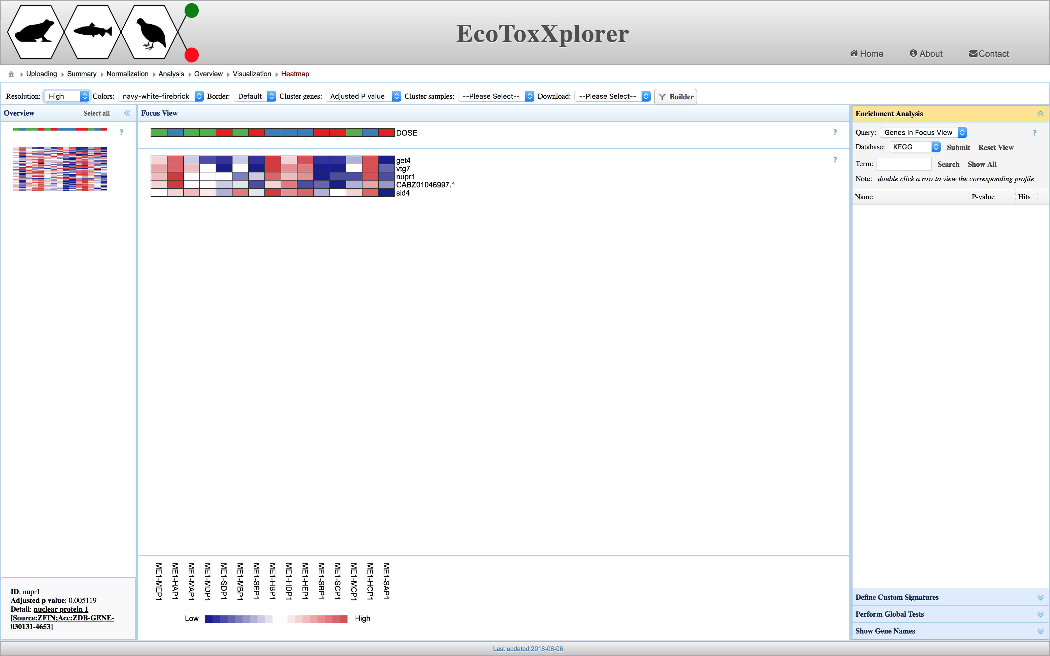
Heatmap is basically a 2D graphical view of a matrix of numbers based on assigning different colors to different values. Higher values would have certain range of colors in contrast to the smaller ones. When some type of clustering or grouping of samples (i.e. columns of the matrix) or variables (i.e. rows of the matrix) is performed, the contrast of colors can indicate a pattern of interest.
In the following figure, the heatmap visualizes an expression matrix where higher expression value and lower ones are assigned red and blue scale of colors, respectively. The header at the top provides meta data (or annotation) of samples. In this case, the heatmap shows that a gene like “nupr1” is very responsive when the dose (see header row) changes from green group to blue group.
